Overview
Scatter Plots in Power BI !
Can you count how many times you have used Scatter Plots for Power BI reports? I can and it’s not a lot. And I know for sure I’m not alone here.
The reasons Scatter Charts are not as widely used as others like Bar or Pie Charts could be because a lot of users don’t know enough about it.
Or perhaps, they don’t know in what situation to make use of it. Or, may be, they just don’t know how.
Well, fear not. We will be getting hands on practice with an exercise and I’m confident that by the end of this article, you’ll be able to build one yourself with any given data.
Question: When should I consider a Scatter Chart for use?
Answer: When you would like to show the relationship between 2 quantitative variables (i.e. 2 numerical variables on the x & y-axis).
These variables could be Sales & Profit, Weight & Age, etc.
Scatter Charts would tell the type of pattern, correlation or trends between these variables thereby uncovering interesting insights from the data.
If you want to know more about Scatter Plots i.e. the kinds of patterns or correlations there are and how to interpret them, check out my last post here (I strongly advice that you do if you have yet to, before proceeding with this practice).
It would also be interesting to note that Scatter Chart is the only animation chart by default in Power BI.
This means that it is the only chart present in Power BI (i.e. Not a Custom Visual) that moves around (animated) when activated.
Let’s get to it then.
Case Study
For this exercise, we’ll be making use of a Sales data (you can download the data here to follow along or to practice after).
We want to see the relationship between Sales and Profit in the data, to know whether there’s a positive, negative or zero correlation between the 2 variables.
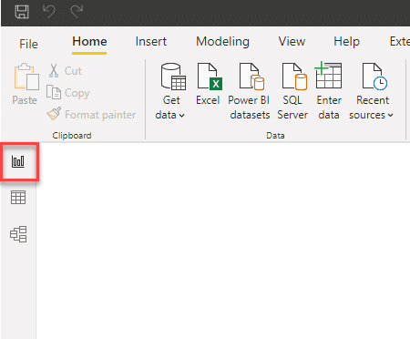
First, we must ensure we are in the Report View.
Creating a Basic Scatter Plot
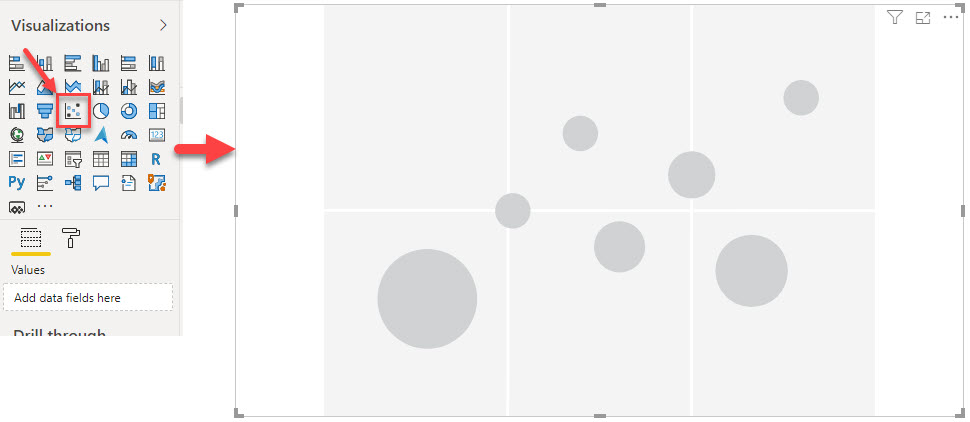
Notice the requirements needed for this visual as it is being selected in the ‘Fields’ settings panel.
- Details: to specify what categorical column the visual represents
- Legend: to specify which column sub-divides the Details data
- X-Axis: specify what column represents the horizontal axis
- Y-Axis: specify what column represents the vertical axis
- Size: specify the column that represents the marker sizes
- Play-Axis: specify what column (usually a date column) is responsible for the trend overtime.
- Tool Tips: add a data field or measure to be included in information displayed when hovering on a mark in the chart.
NB: Not every field needs to be specified in order to create a simple scatter chart. Only 3 of them are truly required (x-axis, y-axis & Details). The rest are to display additional information about the data.
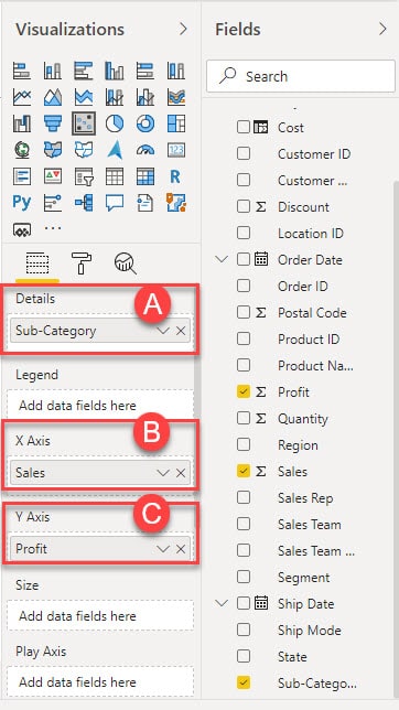
- From the Fields Pane, drag Sub-Category to Details, Sales to X-Axis and Profit to Y-Axis buckets of the Visualizations Pane.
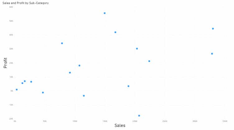
The Scatter Chart is coming to life.
As you can see, the visual reveals a trend of markers that represents the product sub-categories and how their sales relates to the profits/losses.
You can decide to leave it as it is or go on to specify additional fields to display more info.
Enhancing the Scatter Plot
We’ll go on to specify additional fields:
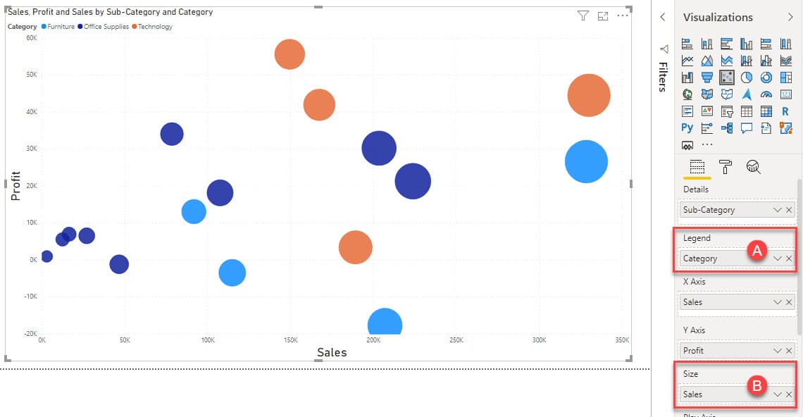
- From the Fields Pane, drag Category to Legend and Sales to Size buckets of the Visualizations Pane.
Legend as Category changes the colors of the markers to match the 3 categories of the products in the data (Furniture, Office Supplies & Technology).
While the Size as Sales changes the size of the markers to match corresponding Sales, which means the largest marker in the visual is the one with the largest sales value.
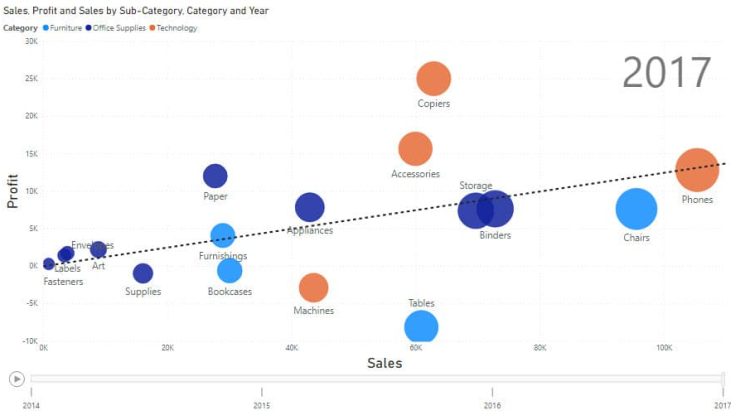
Interpreting this Scatter Chart, there appears to be a positive correlation between both variables; Sales & Profit. This means that as the value of Sales increases, that of Profit also increases.
Showing the Labels of the Marks
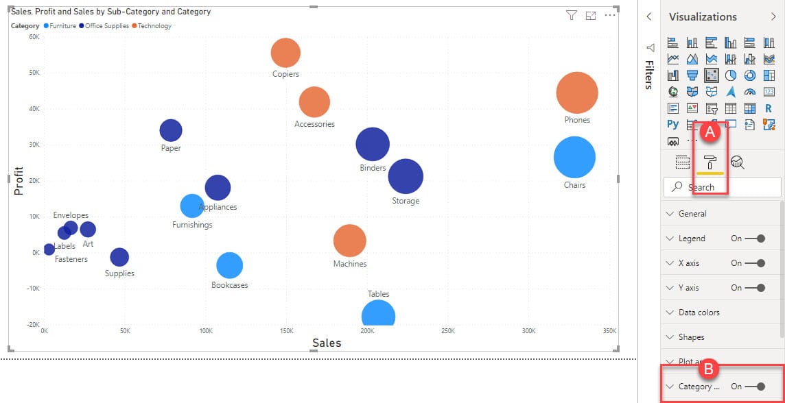
Navigate to the Format pane and turn on ‘category’. This shows the names of sub-categories underneath each marker for better interpretation.
You can explore other formatting options such as title change, switching the legend position, changing of data colors, adding shadows, etc. Just have fun with it and see how far you can go.
Moving to the Analytics section; We can add a few features to uncover some interesting insights in the data such as;
Creating Quadrants and Trend Lines
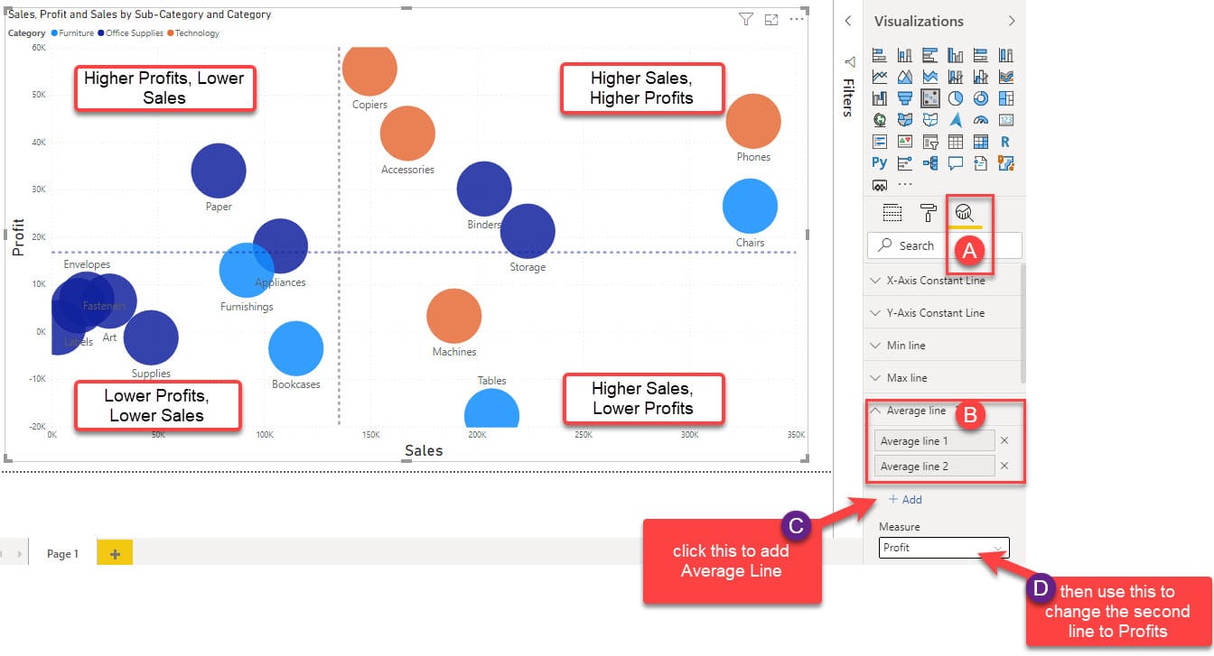
- Average line: displays a dotted line in between the chart indicating the average Profits or Sales values.
This create a sort of Quadrant where in comparison to the Average, we can see the sub categories that have Lower Sales and Lower Profit, Higher Sales and Lower Profits, Higher Profits and Lower Sales and Higher Profits and Higher Sales.
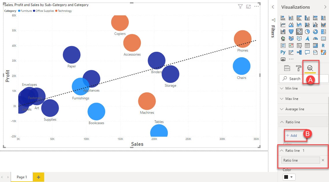
- Ratio line: is the line that goes through the origin and allows you see how much a given point deviates from overall. It’s not a good idea to have the quadrants and the ratio/trend line on the same scatter chart. So, remove the Average Lines before adding the Ratio Line.
Animating the Scatter Plot
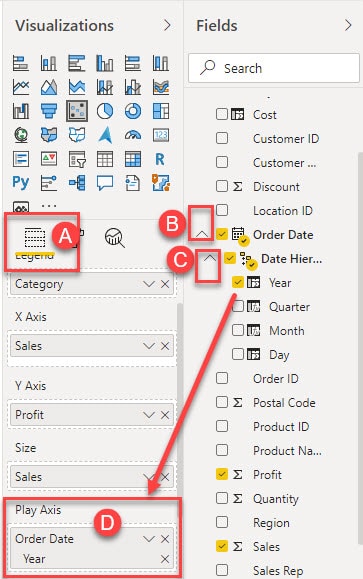
And finally, we cannot conclude Scatter plots in Power BI without talking about the Play Axis function. To activate this;
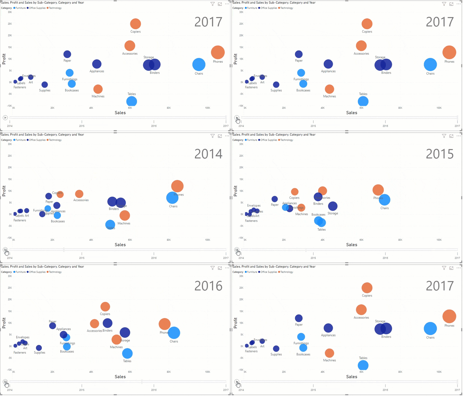
Navigate to the Fields pane, drag and drop the preferred date column; either Year, Quarter or Month to the Play Axis’ field and hit the play button that appears in the visual.
The animation that comes up afterwards shows the trends of the products overtime (Yearly, Quarterly, Monthly or Daily).
It shows which category of product was leading or lagging at a particular period of time.
Conclusion
And that’s basically all you need to know about creating a Scatter Chart in Power BI.
Scatter chart is one of the most useful charts in Power BI which when used right can uncover many hidden information about the data.
If you haven’t been using it that often, you might want to try it out right now.
Thanks for reading, see you soon.

