Happy New Year!
As you probably already know, Power BI releases updates for the tool every month.
Although 2020 was such a ‘special’ year, that did not stop the developers from constantly trying to improve the BI tool.
So, in this article, we are going to be reviewing some of the updates made by Power BI in 2020 so we can see how far we have come.
Let’s go!
January/February
- Incremental Refresh: this allows you optimize all refreshes so you don’t have to refresh all of the historical data every time you do a refresh. This feature makes your refresh much faster & reliable.
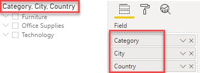
- Hierarchical Slicer: create hierarchies in your Slicer by inserting more than 1 column in the slicer field;
- New DAX Functions: FirstNonBlankValue, LastNonBlankValue
- Title bar updates
- Microsoft 385 usage analytics
- Non-admin support for query diagnostics
- New Connectors: Microstrategy, FHIR, Factset, TIBCO, Jamf Pro & Asana.
- Improved report usage metrics
March
- Dual axis for Line Chart now available
- Page navigation action type for buttons:
- Page navigation
- Drill through
- Multi-column sort for tables i.e. you can now sort items in a Table/Matrix chart based on more than 1 field.
- Filter pane search
- Updates for decomposition tree:
- Bars per level formatting option
- Updates to behavior of data bar length
- New ribbon now on by default
- New DAX functions: COALSCE
- Query diagnostics
- Connectors: Hive LLAP & Cognite
- Enhanced dataset metadata (preview)
- New search experience for Power BI service
April
- Personalize visuals
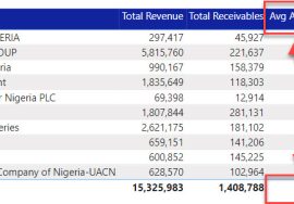
- Conditional formatting for totals & subtotals in the Table & Matrix
- Rectangular lasso select across visuals: users can now select multiple visuals with a simple click & drag.
- Change detection for page refresh
- Relative time filter
- Customize theme dialog: ability to customize theme to one’s taste became generally available
- Improved discoverability for conditional formatting
- Direct Query support for AI visuals i.e. Decomposition tree & Key influencers
- Q&A visual now updated
- COVID-19 Apps
- Enhancements to query diagnostics
May
- Drop shadow support for visuals
- Apply all filters
- Curate featured tables for Excel
- Drill through action type for buttons
- Buttons now support fill images
- Copy a visual as image
- Filter pane migration
- Direct Query on Dataflows
- Web by example automatically suggests tables by default
- Connectors: Witivio, Linkar, Webtrends, Planview project place, Vessel insights, Zoho creator, Sagra emigo.
- PowerApps visual now included by default
- Hierarchical variance table
- New file format: .pbids
- Power BI apps for Teams (preview)
- Power BI premium per user (preview)
June
- Enhancements to Mobile layout authoring
- New phone emulator
- Updated visualization pane
- Can now overlay visuals
- Hierarchical slicer
- New icons included. Can be found via: Format > Items > Expand/collapse icon
- Stepped layout indentation i.e. space between expand/collapse icons can now be adjusted
- Line chart dot formatting options i.e. can now select different colors for every data (dot) point.
- Automatic page refresh
- Modern ribbon now generally available
- AI insights
- Agile HR analytics (Template App)
- Uber User Data Report (Template App)
- Palantir Foundry connector: A platform that reimagines how people use data by removing the barriers between backend data management & frontend data analysis
- Dark mode for iOS app
July
- Gradient legend for charts i.e. conditional formatting can be added to charts e.g. bar chart with legend.
- Ability to rename Slicer header text: especially useful during hierarchical slicing.
- Relative time filter made generally available
- Enhancements to Q&A
- Support for Excel financial functions
- Model view enabled for live connect made generally available
- Global option to disable automatic type detection
- Launch external tools from Power BI Desktop (preview)
- Page view for Paginated Reports
- Sensitivity labels persist when a report is embedded in an app
- Label inheritance upon creation of new content
August
- Perspectives support for Personalize visuals
- Rectangular lasso select for data points (preview): i.e. you can now select data points on a viz by clicking & dragging over its plotting area. Available for Line, Area & Scatter charts.
- Added dynamic formatting support to more visuals
- Direct Query support for Q&A (preview)
- Text/CSV by Example (preview)
- New Connectors: Cherwell, Automation Anywhere & Acterys.
- Multiple data lakes support for Dataflows
- Updated headers & navigation in Mobile
- Data protection updates
September
- Smart Narratives (preview): this feature provides relevant customizable insights from your chart.
- Total labels available for stacked visuals e.g. Stacked bar chart
- Q&A now supports arithmetic operations: addition, subtraction, division & multiplication.
- Mobile authoring enhancements
- Bookmark made available for Mobile layout view
- Can turn off gridlines & snap to grid
- Pinch & zoom made available in all report views
- Data point rectangle select for additional charts
- Added general visual option to maintain layer order
- Share from Power BI (iOS & Android)
- Auto play a slideshow on startup (Windows)
- Excel inherits the Power BI dataset’s sensitivity label when using a PivotTable connection
- New Connectors: CDS connector (preview), Azure Databricks, MariaDB & Hexagon PPM Smart API
October
- Power BI icon update
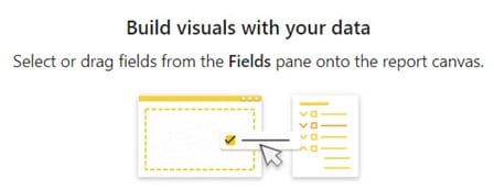
- Canvas watermarks: this feature makes it easy for beginners to navigate the Power BI Desktop
- Personalize visuals now generally available
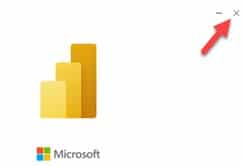
- Desktop splash screen dismiss: i.e. you can now close the Power BI desktop while it’s loading instead of having to wait for it to finish loading before closing.
- Data point rectangle select for Treemap
- Automatic Table Detection from Excel & JSON files
- New Connectors: Spigit, eWay-CRM
- Power BI for HoloLens 2 (preview)
- Automatic page refresh is now supported on the Windows app.
- Simplified installation
November
- New Field List
- New Model View
- Anomaly Detection in the analytics pane for charts like Line, Area or Scatter Charts
- Visual Zoom Slider now available for charts
- Apply all filters now generally available
- Data point rectangle select extended to Map visual
- Q&A now supports partial matching data values
- New connectors: Actian, Anaplan & Starburst Presto
- Certified & Promoted reports & apps
December
- Small multiples: can be found in the fields list & formatted in the format pane
- Direct Query for Power BI datasets & Analysis Services
- Increased rectangle select data point limit (now 3500)
- Selection pane is now available in mobile layout view
- Dark mode support in the Power BI Android app
- Anomaly detection is now supported in all mobile apps (iOS, Android & Windows)
- Microsoft Dataverse connector
- Custom publish message
- New export settings available in Power BI admin portal
- Power BI Premium per user public preview now available
- New Admin APIs
NB: Some of the features are still in preview mode and will need to be enabled first to access. Preview features can be enabled from Preview features option under the Options & Settings dialog.
That’s all for 2020.
My highlight features include Smart Narratives, the dual axis for Line chart, the drop shadow & of course, the new Power BI icon. What’s yours?
Cheers to more useful features in 2021!!


