When talking about charts that are uncommonly used in Power BI, Waterfall Chart is usually not so far down on the list. Why? Who knows?
Maybe users take one look at the chart (or the name *wink wink*), see the colors or weirdly placed bars and think it must be one of the difficult ones to use or a hard one to interpret.
When on the contrary, it’s quite easy to create & interpret & it can be extremely useful in uncovering interesting insights in your data.
What’s a Waterfall Chart and when is it used?
The primary function of the Waterfall chart is to display the running total of a given value over a period, in a manner that can reveal variance.
It can also show how a selected factor (e.g. location, product categories, etc.) affects the total (either positively or negatively).
The chart leverages three attributes:
1.Position: to show the current total value
2. Color: different colors to show the direction of variance. Positive or Negative
3. Length: to show the magnitude of variance. Small difference or Large difference
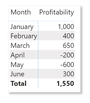
Consider this simple example of Monthly Profit/Loss of a business:
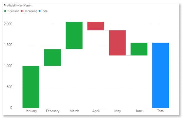
The above report shows profits in all months except April and May. When you plot this on a Waterfall Chart, more details will emerge.
Now with a waterfall chart, we can tell the following:
1. Profit grew from 1,000 to 2,000 from January to March and ended at 1,500 in June. This is shown by the positions of the bars as at each month.
2. Profit increased every month from January to March, then dropped consecutively in April and May before increasing again in June.
This is shown by the colors. Green depicting increase and Reddish depicting a decline in profits.
3. Of the four months that produced an increase in profit after January, March had the highest increase (shown by the length of the bar) while the loss in May is far bigger than April’s loss. Also shown by the length of the bar.
Putting all of these in Variance perspective, we can also say there was:
- Positive variance in February
- Bigger Positive variance in March
- Negative variance in April
- Bigger Negative variance in May
- Small positive variance in June.
If we wanted to know why our profit is low for example, April and May are the causes. They negatively affect the Total Profit.
How to use Waterfall chart in Power BI
In this post, I will be showing a simple demonstration of how to create a simple Waterfall Chart with Power BI.
In case you don’t already have this data & you would like to practice along, download the Superstore dataset I’m using here.
Let’s get to it then;
After importing the data into Power BI;
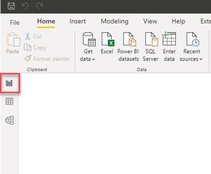
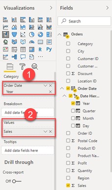
1. Navigate to ‘report view’
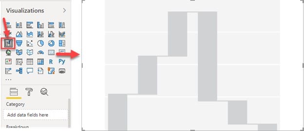
2. Click on the chart icon on the Visualizations pane & expand to fit the report page.
3. Notice the 4 requirements that appear in the Details Pane as the chart is selected.
- Category: specify what column (usually a time-based column) is responsible for the chart trend.
- Breakdown: specify which column you would like to explore the changes between categories (e.g. location, categories, product, etc.)
- Values: specify the numeric amount to plot.
- Tooltips: specify additional data fields that users can see when they hover on part of the visual.
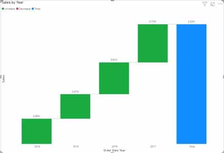
4. From the Fields pane, drag Year into the Category pane & Sales into Values. The result is shown below.
As you can see that even without filling all fields (i.e. Breakdown & Tooltips) yet, the visual already looks relevant.
Interpreting the chart above;
- There’s a positive change in sales from the year 2014 straight to 2017 (indicated by the upward green bars).
- The blue bar at the end indicates the total amount at the end of the year when collated.
- The largest sales occurred in year 2017, lowest in 2015.
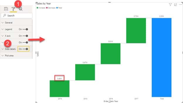
For better clarity & understanding, turn on the chart’s data labels in the Format pane.
Now we can see the respective amount made for every year above the bars.
To dig further & explore more changes, let’s make use of the Breakdown field;
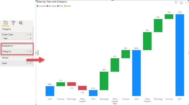
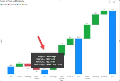
5. Drag and drop ‘Category’ into the Breakdown field. The changes appear as shown below;
Don’t fret, let’s look through this together;
- The new data points that appear are the categories present in the data; Furniture, Office Supplies & Technology & they appear for every year, each with their respective data label.
- The green bars indicate which category causes an increase in sales while the red bars indicate which category causes a decrease in sales
For example, the chart shows that in year 2015, the sales for Technology and Office Supplies decreased (indicated by the red bars).
You’ll be able to see the percentage decrease and other info. when you hover your cursor around the red bars i.e. Tooltips
- The blue bars indicate the total amount made at the end of each year
You can decide to continue exploring by;
- Sorting differently (by Sales instead of Year)
- Dropping other columns like City, Sub-categories, Region, etc. into the Breakdown field.
- Playing with the sentiment colors in the Format pane, and so on.
Conclusions
Waterfall is a very straightforward type of chart, doesn’t ask for much yet reveals a lot. It’s one of my favorites. I don’t see why it shouldn’t be one of yours too (haha).
If you have time to spare, check out my last post on how to use Scatter Plots in Power BI.
Thanks for reading, see you soon.

