Introduction
Is there a possibility that Table Heatmaps can be used as alternative to Line Charts?
At least in certain circumstances. In this article, I am not planning to convince or confuse you. I just want a conversation 😁.
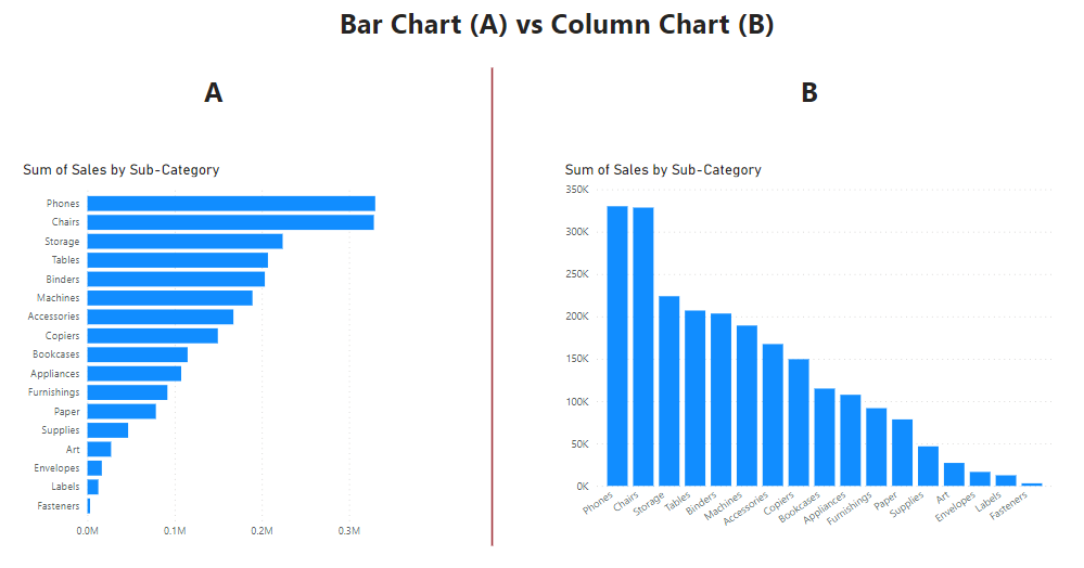
Afterall, for every time I tell my students that Bar Charts are easier to read than Column charts. Then I try to prove it by displaying both, I end up having the class split into 2 groups.
Many of them say they find Column Charts easier to read.
So basically, we will go through some scenarios together and I’ll let you be the judge. Please let us know what you think in comments. We can compare with what others comment as well.
Visual Coding in Charts
Let me start by describing the visual coding of both visuals.
As you know, all visuals are coded in certain ways to communicate the context in information.
When you visualize some data using a Bar chart, it conveys a different message from when you visualize the same data with a pie chart.
The message in the bar chart leverages the height/length of the bars to inform the ranking of the categories for the observed metrics. While the pie chart leverages the angle of the arcs in the 360 degrees shaped pie chart to inform the % share of the categories for the observed metrics.
A Line chart leverages the position of markers/points, across a time period to inform the trend (upwards vs downwards) of the observed metrics.
A Table heatmap leverages color hue, density or concentration to inform the concentration of an observed metric within the categories.
At the end of the day, the story in the data comes from things like ranking, %share, trends, distribution etc. And the visuals in use can sometimes tell the same story, the clarity may just be different.
Line Charts are generally used for trends and figuring out Seasonality.
But, is the story always clearer with Line?
Or are there times Table Heatmaps will do a better job.
Now, let’s look at the scenarios, bearing in mind that the goal is to see which visual conveys the message quicker and clearer.
Scenario 1:
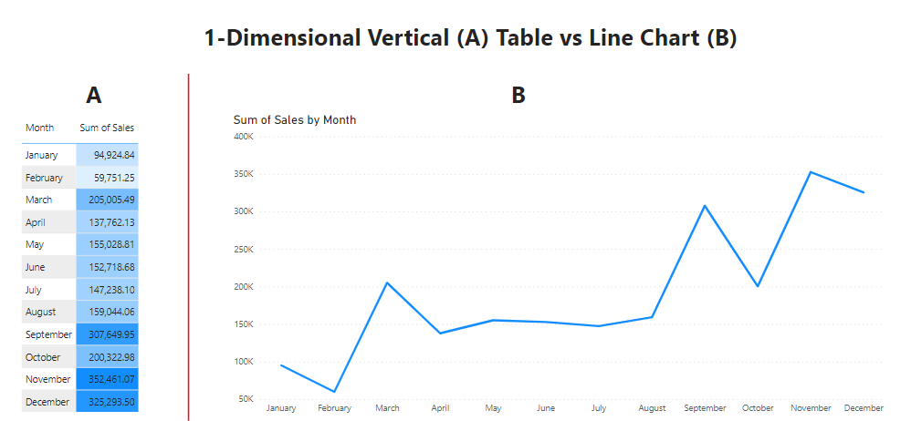
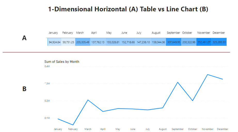
Checking Sales trend by Month
Scenario 2:
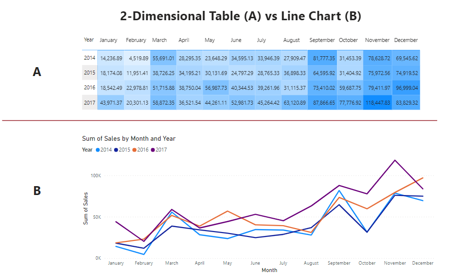
Checking Sales Seasonality by Month by Year
Scenario 3:
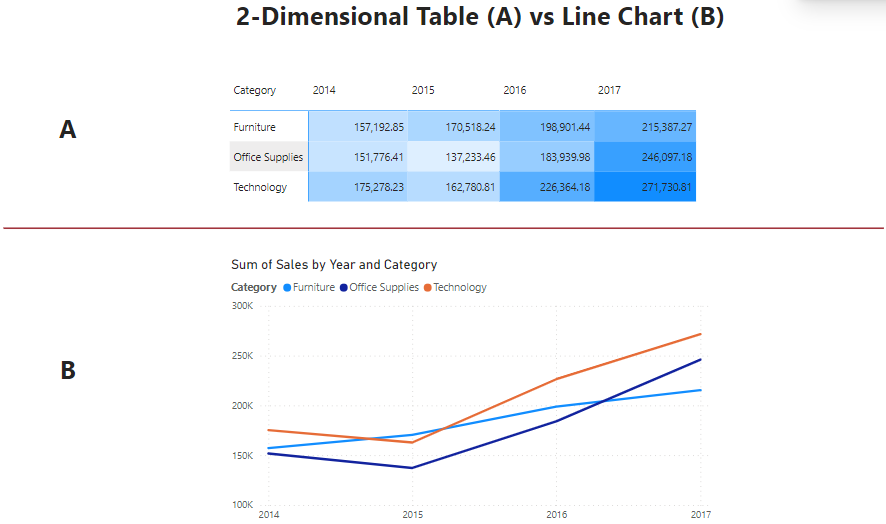
Checking Annual Sales Trend for Product Categories (This has fewer lines and duration compared to Scenario 2)
Scenario 4:
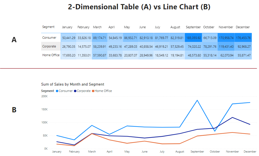
Checking Monthly Sales Trend for Product Categories (This has fewer lines like scenario 3, but with a longer duration)
Conclusion
So, there you have it. Tell me what you think in the comment section below.
Ps: check out the free introductory courses we have on here if it can benefit you or someone.

