Hello there.
Today’s topic is about some of my favorite charts to use, they also happen to be the most commonly used in the data visualization ecosystem; Bar & Column Charts.
As you probably already know, both Bar & Column charts are very useful in data viz; for showing comparisons & also trends in your data.
Both are basically the same, only difference is that one is lying down (Bar chart), & the other is standing straight (Column Chart).
Now does this mean that they can be used interchangeably in any situation? Maybe…Not in all cases.
Let me ask first; are you one of those who use whichever one of the 2 that catches your eye first? Or are you intentional with your choice? I’d hope you’re the latter. But if you’re the former, no problem. I’m here to help you get it right.
So in what cases do you decide which to use between the Bar Chart & the Column Chart?:
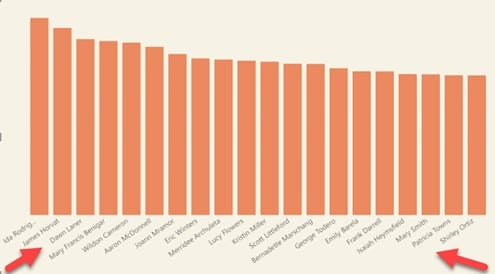
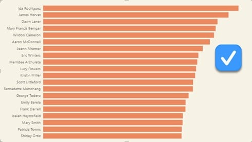
- Use A Bar Chart when the Categorical Label is Lengthy;
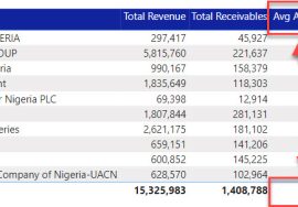
When the categorical names are lengthy; like in the figure above, it’s preferable to make use of a Bar Chart instead of Column because the former provides more space & eliminates clutter.
The visual then becomes easy for the audience to examine without the need to squint their eyes or bend their heads while trying to read the labels.
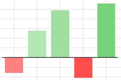
- Use a Column Chart when the Dataset Contains Negative Values;
If there are negative values in your data and you’d like to use one of the 2 charts, the best option for this is a Column Chart.
A Bar Chart is also suitable (particularly if color-coded) except that not everyone (me included) is quick to navigate between the left & right direction. It is not as quick & clear as navigating between the upper & lower direction where upper clearly means positive & lower, negative.
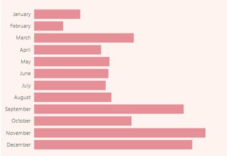
- Use a Column Chart to Show Trend Over Time;
If for some reason you are not interested in using a line/area chart to display the trends in your data (e.g. from Jan – Dec), a column chart is more fitting for this than a bar chart because it gives the same feel as a line chart & also many people are more familiar with reading trends from left to right rather than from up to down.
- Use a Bar Chart when the Categories in the Data Are Many;
…as it is easier (and more familiar) to scroll down when exploring the data than to scroll sideways.
Although if you can, try to limit the number of categories displayed in your chart (i.e. show only important ones) & then use the other factors mentioned to figure out which chart is most appropriate for you.
NOTE: Unless you have a continuous data used to show trends, it’s good practice to always arrange your data in order (ascending or descending) to allow for quick understanding.

