There are endless options of chart types to pick from when visualizing; ranging from Bars to Lines, to Waterfalls, to Ribbon charts… so many.
The choices are so wide that it can sometimes get confusing.
While it’s okay to want to explore your options, there are some chart types that just do not work.
They might look aesthetically pleasing or catchy but if they don’t communicate the right information to your audience, then they are just as useless.
This week, we’ll be looking at some basic chart types that you should say no to when creating your visualizations;
- Pie Charts:
Are you surprised? Or have you heard this one before.
Anyway… Coda Hale once expressed his opinion of Pie Charts as “the information visualization equivalent of a roofing hammer to the frontal lobe… They have no place in the world of grownups, and occupy the same semiotic space as short pants, a runny nose, and chocolate smeared on one’s face. They are as professional as a pair of assless chaps. Anyone who suggests their use should be instinctively slapped”.
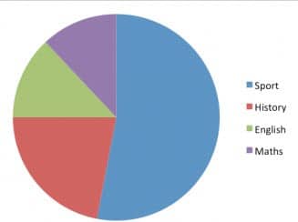
Phew! Okay, maybe Coda Hale was a little harsh? (or not). Let’s get more technical; Pie Charts just are not suitable enough for data storytelling. Take a look at the chart below;
Normally, a visual should be able to give a pictorial representation of a data without the need for a data label.
For the figure above, you cannot accurately tell the sizes of each slice because there’s no x-axis or y-axis to refer to (unlike a bar chart).
The best you can do is try to guess their sizes, the only way you can be certain is if data labels are included.
But without them, (data labels), the chart becomes mentally tasking & time consuming for the audience during interpretation.
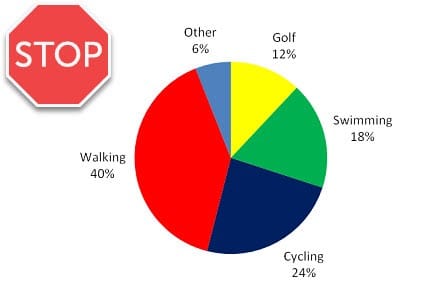
Also, Pie Charts are particularly not suitable for data with more than 3 categories, alongside having to assign different colors to each slice (which can cause confusion), another problem is trying to tell which slice is bigger when the categories are many & similar in size.
Like Coda Hale said earlier, they have no place in the world of grown ups and if you are a constant user of Pie Charts, it’s time to stop.
- Donut Charts:
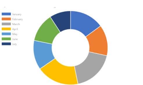
Look, Donut Charts are basically Pie Charts except these have holes in them.
They have similar challenges (no axes, color confusion, slice comparison, etc.).
Some professionals argue that a Donut Chart is tolerable compared to a Pie Chart because they don’t take up as much space and the inner arcs can be used to measure sizes alongside the outer angles.
But you know what? It’s like trying to choose between 2 evils where the Donut Chart is the lesser evil.
So if you’re stuck between using a Pie or a Donut chart, I’d say go for a Donut Chart but if there are other options, then ditch both and pick something different.
A good substitute for a Pie or Donut chart is a simple Bar or Column chart.
You might think these are very commonly used but there’s a reason why it is so.
They are more straight forward to interpret because comparing lengths is natural & easy than comparing angles.
- 3D Charts:
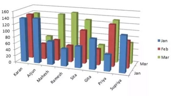
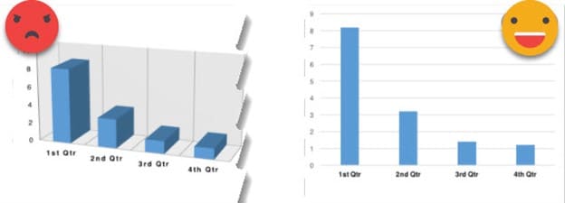
The worst thing you can do to your visual report is to include 3D charts! Just, don’t do it. Sure, they look beautiful & out of the ordinary compared to 2D charts but that is all there is to them.
3D charts tend to skew how we perceive the data thereby passing inaccurate info. into the mind of the audience.
They are inefficient & potentially misleading. You may think that you’re adding depth to the chart when actually, you’re only making it harder to understand.
Keep it simple! Less is more in the world of viz. and if your intention is to pass accurate information across to the audience, then eliminate 3Ds from your visual dictionary.
C’est fini.

