December 23, 2022
Data Visualization
November 16, 2022
Understanding Power BI Page Settings (Part 2)
Power BI Report Page As a Power BI Report Developer, having a good understanding of Power BI Page settings will help you design better reports. What can you do if you need more space
November 2, 2022
Power BI Bookmarks Essentials (Part 1)
Apart from DAX, the other tricky thing to work with in Power BI is Bookmarks. And why not? Bookmarks infuse app-like functionalities in our reports. But we report developers are not wired to create
October 4, 2022
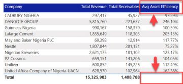
Hide Total For Selected Column In Power BI Table
Apart from the fact that I am baffled by how my Power BI reports use Tables, Power BI tables are not one of the easiest objects to work with. We still need to use
December 6, 2020
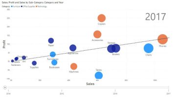
Three (3) Chart Types You Should Avoid
There are endless options of chart types to pick from when visualizing; ranging from Bars to Lines, to Waterfalls, to Ribbon charts… so many. The choices are so wide that it can sometimes get
November 28, 2020
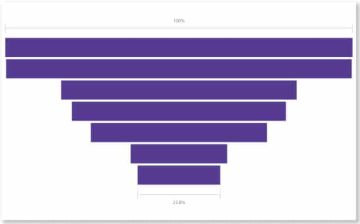
When And How To Make Use Of Funnel Charts In Power BI
So first of all, everything (data, maybe?) that’s poured at the top of this funnel doesn’t flow through the bottom. That’s not the reason for it being called a Funnel chart. Lol Now that
November 14, 2020
How To Effectively Use Bookmarks in Power BI
“Bookmarks”? Yes, bookmarks. You know those thin strips in between books with the main purpose of referring to a particular page, which makes it easy to catch up later? Exactly. Bookmarks in Power BI
October 29, 2020
Be Smart With Smart Narratives
Have you ever spent so much time working on a Power BI visualization that when you are finally done, you just wish there was a way for the summary report to write itself while
October 10, 2020
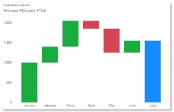
How To Use Waterfall Charts In Power BI
When talking about charts that are uncommonly used in Power BI, Waterfall Chart is usually not so far down on the list. Why? Who knows? Maybe users take one look at the chart (or
September 26, 2020


