So first of all, everything (data, maybe?) that’s poured at the top of this funnel doesn’t flow through the bottom. That’s not the reason for it being called a Funnel chart. Lol
Now that we’ve gotten that out of the way…
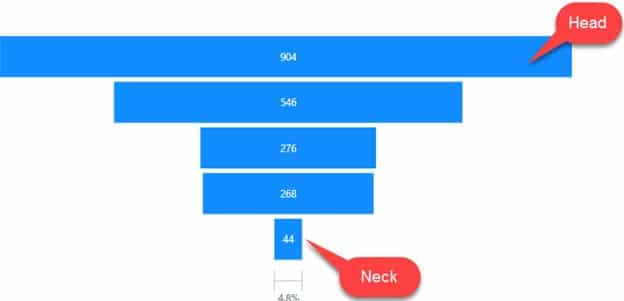
A Funnel Chart, is a type of chart that’s used to show progression/regression of data as it passes through stages in a sales/revenue process.
It is useful for identifying potential problem areas at one glance since the 1st stage is always the largest & the last stage, the least.
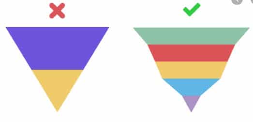
But there’s a problem with its usage. Some people (even myself) sometimes use Funnel charts wrongly, as though it’s a bar or column chart.
This is quite a common issue that most people aren’t aware of but, after I carried out some research, I’ve come to find that there are some specific points to consider before opting to display data with a Funnel Chart.
When Do You Opt for A Funnel Chart?
- When the data is sequential and moves in stages. Preferably, to calculate revenues/deals/sales process.
- When you want to reveal bottlenecks (i.e. problems) in a linear process
- It can be used when you have 3 or more stages to visualize. For data with less than 3 stages, opt for a different type of chart
- Use when the number of items in the first stage is expected to be greater than the number in the final stage
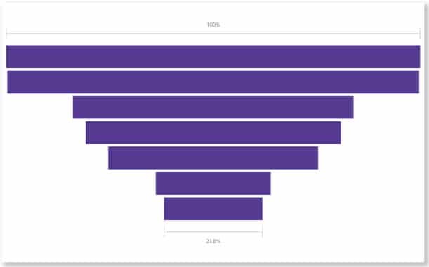
- Do not use if all stages are almost the same length, this will make it difficult for the audience to grasp.
How to Create A Basic Funnel Chart in Power BI
**Download the practice dataset here
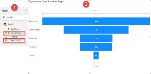
- After loading the data into Power BI desktop, click on the Funnel icon in the Visualizations pane
- Then select appropriate fields in the data; Opportunity Count & Sales Stage
From the data displayed, you can then make observations & start to ask the right questions. Like, why’s the Loyalty so low after Purchase? Why aren’t the customers coming back? and so on.
But basically, that’s it. This is all it takes to build a simple Funnel Chart. It’s simple to use and understand.
Conclusion
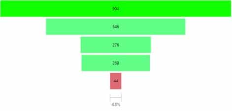
You can decide to take the Funnel viz a bit further by adding a few formats here and there. e.g.
- highlighting a specific bar of interest,
- change of title,
- data colors, etc.
Based on personal preference really. But remember to keep the colors simple so that the audience can be quick to grasp what is being displayed.
Have a nice day 😊

