Introduction
Up until recently, Scatter Plots, also known as Scatter Charts or Scatter Graphs seemed like an unnecessary type of chart to me.
I see it as an option among the other charts displayed during analysis. But I never intentionally used it because I did not fully understand its use, benefits and scenarios in which it can come in handy.
I’m sure there are a lot of people out there; beginners or advanced who do not know how to interpret scatter charts just like me once.
Don’t fret, I am here to break this seemingly confusing chart into fine bits for easy digestion and understanding.
By the end of this article, I’m confident that whoever is reading this will be able to properly identify the types of Scatter Plots there are and also be able to interpret them.
Scatter Plots/Charts
Scatter Plot is a type of graph that is used to examine the association or relationship between two measures/variables (i.e. x & y).
Saying relationship between two measures/variable or x and y is just a fancy technical way of saying “examine how one number affects the other”. How does Global Oil Prices affect a country’s GDP?
These variables are both numerical (i.e. number to number on the x & y axis) not numerical & categorical (which is usually what is used in bar plots, pie charts, etc.).
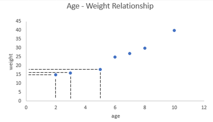
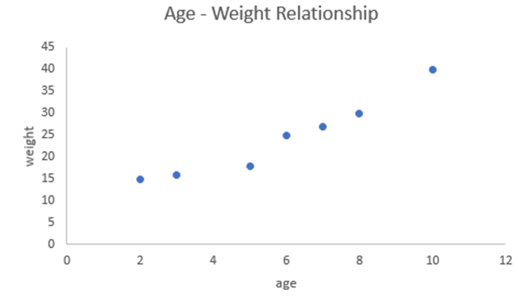
When we have 2 sets of variables, say for example we have Tanya’s age [2, 3, 5, 6, 7, 8, 10] and Tanya’s weight [15, 16, 18, 25, 27, 30, 40] over the years.
We can make use of Scatter Chart to compare both set of variables to check for what kind of relationship is present between them and know if one variable affects the other.
Each point/mark on a scatter chart indicates a position on both variables (x & y). That is, for example, when the age (x) is 2, the weight (y) is 15.
You can draw an imaginary line to connect the marks to the axis as shown below.
Reading Scatter Charts
There could be a positive, negative or no relationship between both variables (we’ll look at these in a few).
There are 3 categories in which one can use to define the features of a Scatter Graph
- Direction (Positive, Negative)
- Pattern (Linear, Non-Linear or No Apparent Correlation)
- Strength (Perfect, Strong or Weak)
Direction
The direction of a scatter plot can either be;
- Positive: this means that both the x & y coordinates increase. The markers usually appear to move from the lower left to the upper right side of the chart, indicating that when the value on one of the axes is high, there is a corresponding high value on the other as well.
Using the Age – Weight chart as an example, when Tanya’s age increases, the scatter chart indicates that Tanya’s weight increases too. We call that a positive relationship.
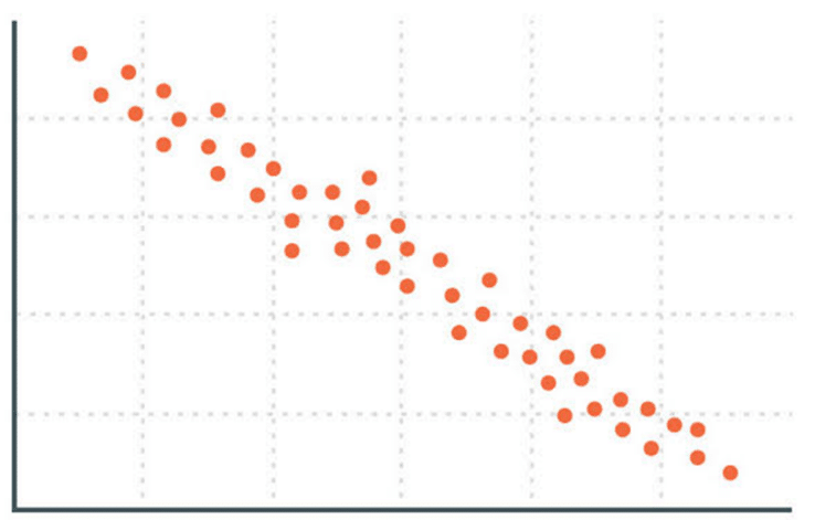
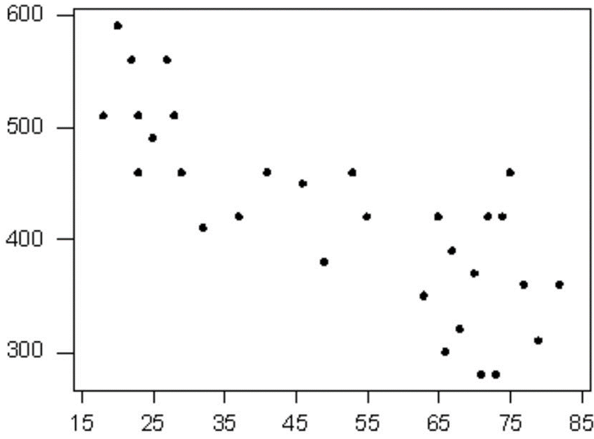
- Negative: this occurs when one coordinate increases as the other decreases.
The markers appear to move from the upper left to the lower right, indicating that when the value on one of the axes is high, it’s corresponding value on the other axis is low and vice versa.Let’s assume the chart above is a plot with 2 sets of variables ‘Time Spent Watching TV’ & ‘Time Spent Studying’, the slope is negative because the more time spent watching TV, the less time there is to study.
Pattern
There are 3 different patterns to observe when interpreting a scatter plot;
- Linear: if a scatter plot is linear, all or most of the markers (or dots) will fall near a straight line (also known as the trend line).
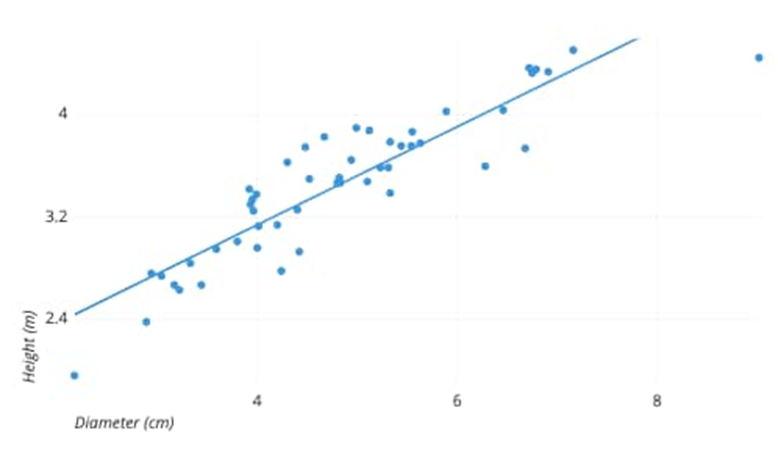
Figure 3: linear positive correlation (source: https://chartio.com/learn/charts/what-is-a-scatter-plot/)
A relationship is linear if one variable increases by approximately the same rate as the other variables changes by one unit.It’s like saying, for example, the percentage increase in the weight of dumb bell results in approximately the same percentage increase in the prices.If a dumb bell weighs 10kg and sells at $5, and the 20kg dumb bell sells at $10, the 30kg dumb bell sells at $15 and the 40kg sells at $20 or say $18.That means, every time the weight doubles (100%), the price also doubles (100%) or nearly doubles.
- Non-linear: the markers for non-linear scatter plot fall into a shape other than a straight line. This non-linear shape is because one variable does not continue to increase at a constant rate, it starts decreasing after a certain point.
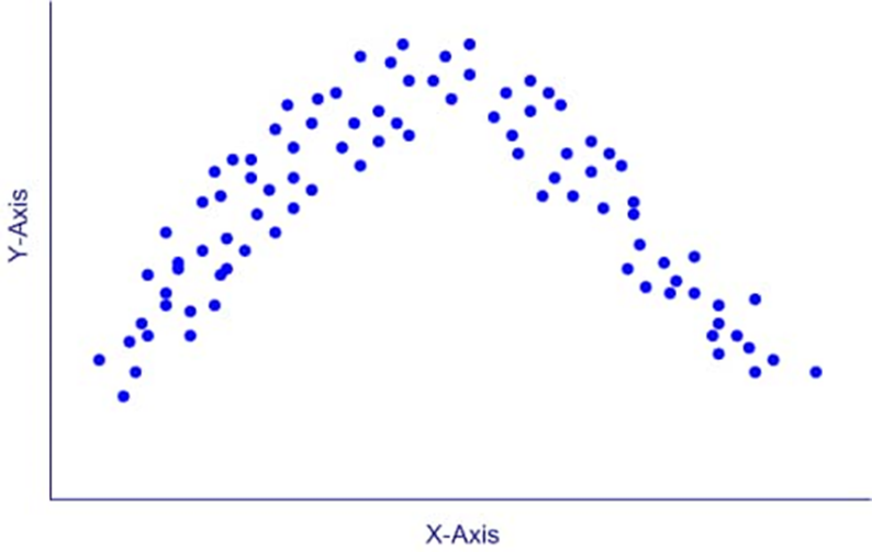
Figure 4:non-linear correlation (source: http://www.ablongman.com/graziano6e/text.site/MATERIAL/statconcepts/relationship.htm)
Let’s assume the graph above represents the relationship between Tanya’s Age and her Working Memory.Her working memory increases throughout childhood, remains steady during adulthood and then decreases as old age approaches, thereby causing a final downward slope.
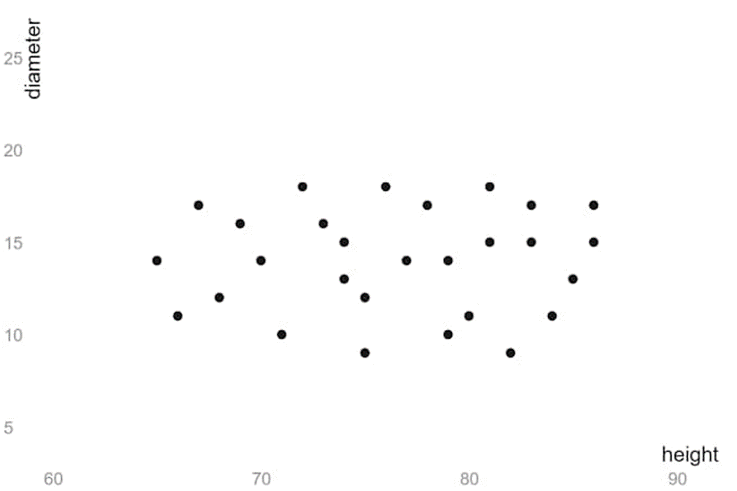
- No apparent relationship: The markers here do not follow any pattern or direction.
An example of this can be shown when a variable; ‘Tanya’s Age’ & another variable, ‘Price of Biscuit’ are plotted together.These variables will show no relationship because one has no effect on the other.
Strength
The strength refers to the degree of ‘scatter’ in the plot & they can appear to be:
- Perfect: the figure below shows an example of a perfect positive linear scatter plot because of how the markers are concentrated in a perfect straight line.
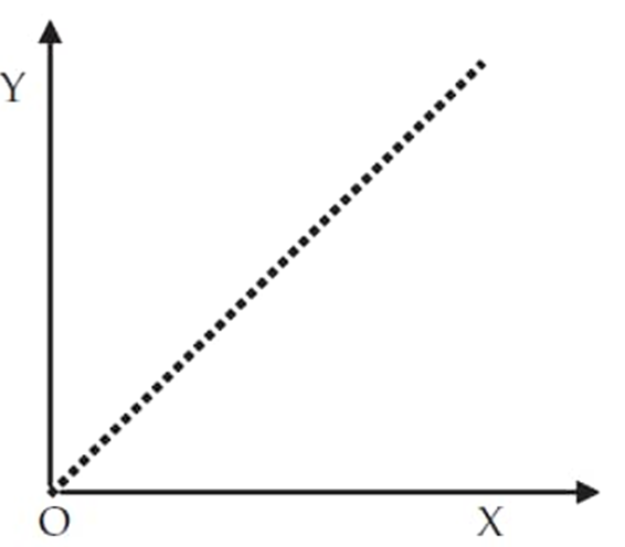
Figure 6:a perfect positive linear correlation (source: https://www.onlinemath4all.com/scatter-diagram.html)
The higher the correlation between 2 variables, the stronger the relationship.
An example of where you might find a perfect positive correlation as in the graph above would be if you were purchasing 1 biscuit for $2. As the number of biscuits increase, the amount of total cost increases. - Strong: occurs when the markers are not in a perfect straight line but are clustered towards each other.The image below shows a very strong positive linear correlation.
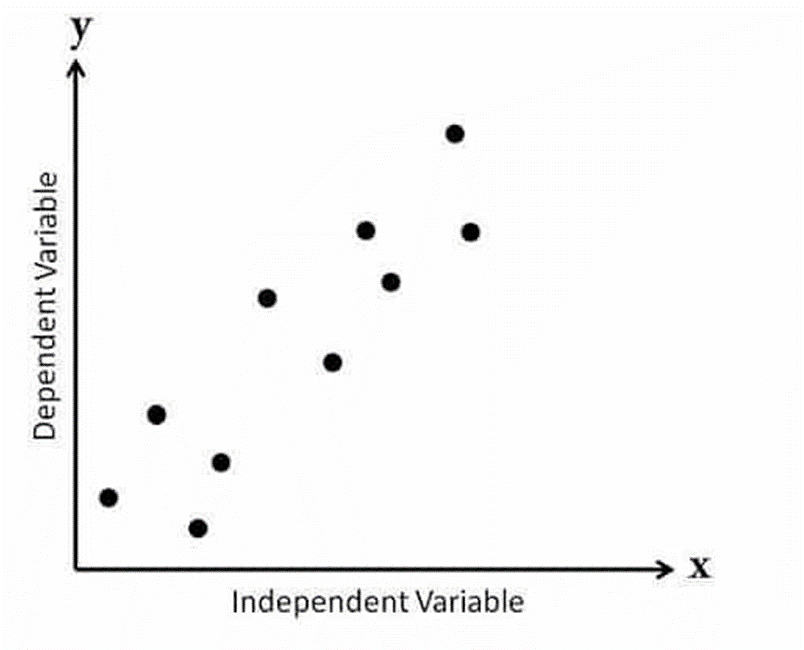
Figure 7: strong positive linear correlation (source: https://pmstudycircle.com/2014/08/what-is-a-scatter-diagram-correlation-chart/)
A situation where you might find a strong positive correlation would be if you examined the number of hours students spent studying for a test vs. the grade received.There won’t be a perfect correlation because two people could spend the same amount of time studying & get different grades.But most likely, they would score higher marks when they study for longer hours. Hopefully.
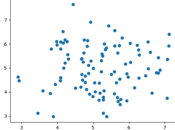
- Weak: The markers in the figure below appear to be all over the graph even though it indicates a negative relationship.
Outliers
Lastly, we cannot talk about Scatter Plots without mentioning Outliers.
Outliers are points that do not fit into a pattern that describes most other data points. They are usually far away from the rest of the values in the data set.
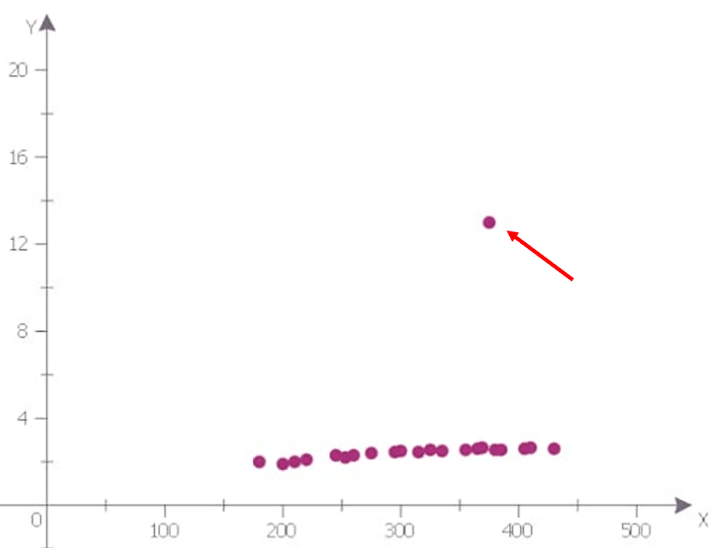
Figure 9: a strong positive linear correlation with an outlier (source: https://www.conceptdraw.com/examples/outliers-on-a-scattergraph)
An outlier in a graph indicates an exception in the regular pattern and the cause of this irregularity can be investigated further by the observer.
Conclusion
To round this mini-tutorial up, let’s observe some charts together to be sure that the subject is well understood.
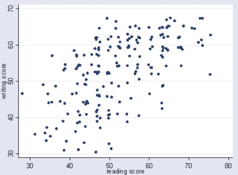
Figure 10 (source: https://www.chegg.com/homework-help/questions-and-answers/best-description-scatter-plot-60-70-80-weak-negative-correlation-w-q31504849)
The trend appears to be:
- Positive because the markers appear to move from the lower left to the upper right.
- Linear because the markers fall in a straight line not curved.
- Weak because the markers are all over the graph.
Therefore, Scatter Graph 1 has a weak positive linear correlation.
- The markers in this plot appear to have no direction or pattern.
Therefore, this has no apparent relationship
We have now come to the end of this mini-tutorial. Did you learn a thing or two? You’re welcome.
Oh, and look forward to next week’s post where we’ll be learning how to make use of a Scatter Charts on Power BI.
Till then, take care.


